Exploring Color Theory in Abstract Art
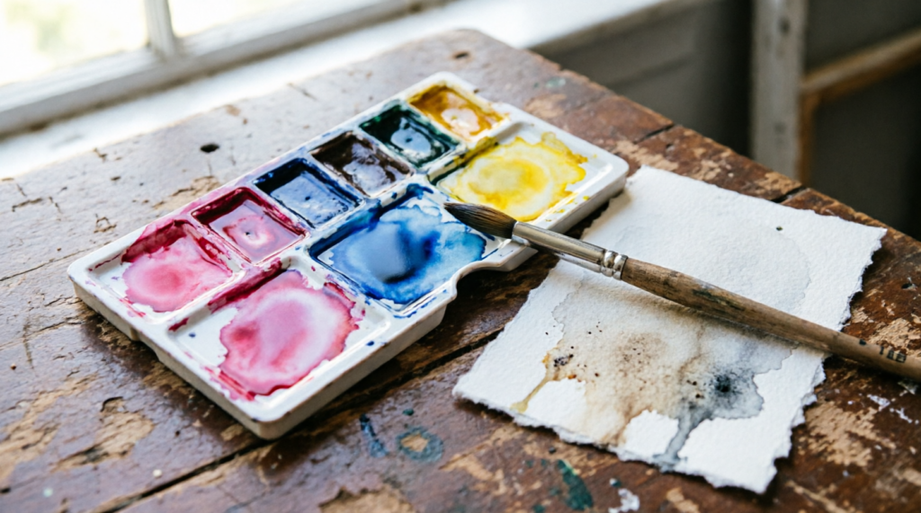
Every painter I’ve taught has had the same experience. You mix a color on the palette and it looks alive. You lay it down, it spreads into the wash beside it, and within thirty seconds it has turned the color of a wet paper bag.
The usual diagnosis is that you overmixed, or used too much water, or should have been more careful. That’s rarely what happened. Muddy color is almost never an accident of technique. It’s a decision you made twenty minutes earlier, when you squeezed three particular pigments onto your palette without knowing what they were made of.
This post is the long version of an answer I give constantly, in workshops, in emails, standing over someone’s paper at a plein air meetup. It covers what’s happening when colors go dead, how to choose pigments that stay clean no matter how hard you push them, and how to use color relationships deliberately in abstract work instead of hoping something good happens.
It’s long. Use the table of contents to jump around, or work through the five studio exercises at the end in order.
The Real Reason Your Colors Turn Muddy
There are three causes, and only one of them has anything to do with technique.
Too many pigments in the mix. Every pigment particle you add to a wash absorbs a slightly different slice of the light spectrum. Two pigments together still leave most of the spectrum reflecting back, so the mix stays luminous. Three is usually survivable. Four or more and you’ve absorbed so much of the spectrum that what bounces back to your eye is, functionally, brown-gray. This is why a five-color “secret formula” always disappoints. The paint isn’t wrong. The arithmetic is.
The practical rule: two pigments per mix, three at the absolute most. If you need a fourth color in a passage, glaze it on top once the first mix has dried rather than stirring it in.
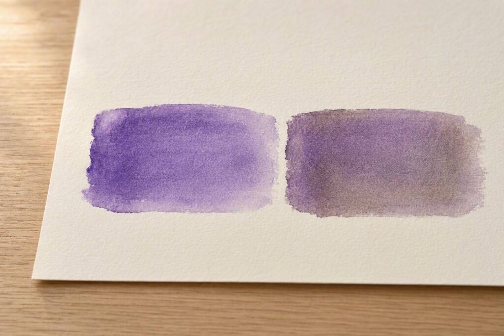
Opposing undertones. This is the one that catches experienced painters. Almost no pigment is a pure primary. Every red leans either orange or violet, every yellow leans either green or orange, and every blue leans either green or violet. When you mix two pigments whose undertones point in opposite directions, you’ve quietly introduced a third color without meaning to.
Mix a warm red that leans orange with a cool blue that leans green and you haven’t made violet. You’ve made red plus blue plus a hidden dose of yellow, which is to say you’ve made brown. It looks like a mixing failure. It’s actually a color wheel doing exactly what it should.
Mixing across pigment families. Earth pigments and modern synthetic organics behave differently in water. The earths, meaning the iron oxides like siennas, umbers, and ochres, are heavy, opaque, and prone to settling. The synthetics, like the quinacridones, phthalos, and pyrroles, are fine-particled, transparent, and staining. Stir them together and the heavy particles sit on top of the paper while the fine ones sink into the fibers. The result reads as chalky and dull even when the hue is technically correct.
None of that is a reason to avoid earth pigments. I use them constantly. It’s a reason to know which category you’re reaching for.
Stop Thinking in Colors. Start Thinking in Pigments.
The tube says “Sap Green.” That tells you almost nothing. Two manufacturers’ Sap Greens can contain entirely different pigments and behave nothing alike. One might be a single transparent pigment, the other a three-pigment convenience mix that will muddy the instant you touch anything to it.
What matters is the pigment index number printed in small type on the tube. PB29. PR122. PY150. That code is the actual identity of the paint, and once you start reading those instead of the marketing name, most mixing problems solve themselves.
Four things to check on any tube:
Pigment count. A single pigment like PB29 will mix cleanly with anything. A convenience mix listing PB29, PY150, and PBr7 has already used up your two-to-three pigment budget before you’ve added a second color. For abstract work, where you’re mixing constantly on the paper, single-pigment paints are worth the discipline.
Transparency rating. Usually a small square symbol, hollow for transparent, half-filled for semi, solid for opaque. Transparent pigments glow because light passes through them, hits the white paper, and bounces back out. Opaque pigments sit on the surface and reflect light directly. Both are useful, but mixed carelessly together the opaque one wins and kills the glow.
Staining versus lifting. Staining pigments like the phthalos and most quinacridones bond to the paper fiber and can’t be lifted once dry. Non-staining pigments can be wiped back out with a damp brush. If you build abstracts by lifting and reworking, and most of us do, you need to know which of your colors are permanent commitments.
Granulation. Some pigments have particles heavy enough to settle into the valleys of the paper texture, creating a mottled, sedimentary surface. Ultramarine (PB29), cerulean (PB35), potter’s pink (PR233), and most of the umbers all granulate. It’s one of the few things watercolor can do that no other medium can.
Common Name Pigment Code Transparent or Opaque Staining or Lifting Granulating Lemon Yellow PY3 Semi-Transparent Staining No New Gamboge PY110 Transparent Low Staining No Yellow Ochre PY43 Semi-Transparent Lifting Yes Pyrrol Red PR254 Semi-Opaque Staining No Quinacridone Rose PV19 Transparent Staining No Ultramarine Violet PV15 Semi-Transparent Lifting Yes Ultramarine Blue PB29 Transparent Lifting Yes Phthalo Blue (Green Shade) PB15:3 Transparent High Staining No Cerulean Blue PB35 Semi-Opaque Lifting Yes Phthalo Green (Blue Shade) PG7 Transparent High Staining No Viridian PG18 Transparent Lifting Yes Burnt Sienna PBr7 Semi-Transparent Lifting Yes Raw Umber PBr7 Semi-Transparent Lifting Yes Venetian Red PR101 Opaque Staining Yes Payne’s Gray PB29 / PBk9 Semi-Opaque Staining Low
The Limited Palette That Can’t Fail
The fastest fix for muddy color isn’t better technique. It’s fewer tubes.
A limited palette forces every color in the painting to share DNA. Because every mix on the paper descends from the same small set of pigments, the whole surface reads as harmonious even when individual passages are wildly different in hue. It’s why paintings by artists with a signature palette feel cohesive across an entire body of work. That isn’t taste, it’s arithmetic.
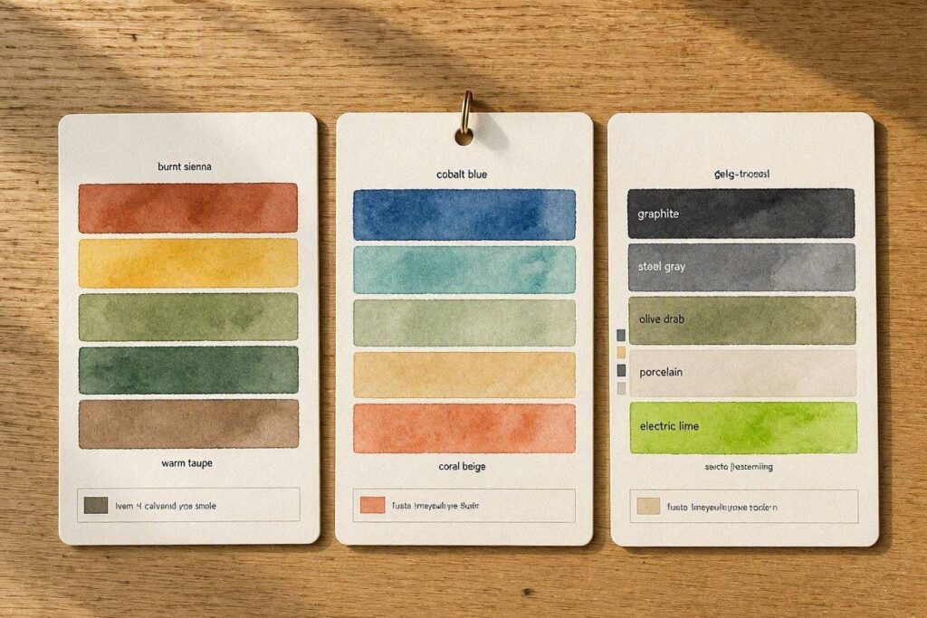
Three palettes worth building. Mix a full page of swatches from each before deciding which suits your work.
The split primary, six tubes. A warm and a cool version of each primary: lemon yellow (PY175 or PY3) and new gamboge (PY97 or PY110), quinacridone rose (PV19) and pyrrol scarlet (PR255), ultramarine (PB29) and phthalo blue green shade (PB15:3). With this palette you can mix a clean version of any hue on the wheel, because you always have a pair whose undertones agree. For a vivid violet, use the cool red with the warm blue. For a vivid orange, the warm red with the warm yellow.
The earth palette, four tubes. Yellow ochre (PY43), burnt sienna (PBr7), ultramarine (PB29), and ivory black (PBk9). Muted, atmospheric, and almost impossible to make ugly. The ultramarine and burnt sienna pairing alone gives you an endless range of grays, warm on one side, cool on the other, granulating beautifully through the middle. If you paint atmospheric or landscape-derived abstracts, this palette does most of the work for you.
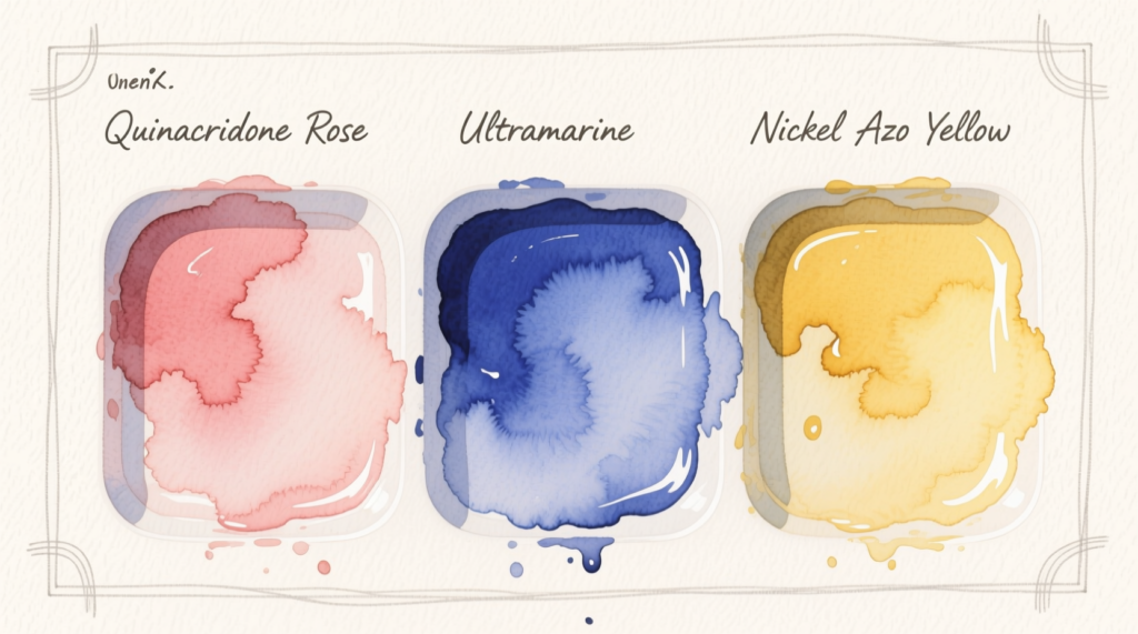
The three-pigment palette. Quinacridone rose (PV19), phthalo blue green shade (PB15:3), nickel azo yellow (PY150). All transparent, all staining, all single-pigment. Every color in the painting comes from these three. It’s brutally restrictive and the single best exercise for understanding what mixing actually does.
Riverbend painting: Exploring Color Theory in Abstract Art
Color Harmonies, With Actual Pigments
The standard color harmony explanation gives you a diagram and leaves you to work out what to buy. Here’s the same information with paint attached.
Complementary. Colors opposite each other on the wheel. Maximum contrast, maximum vibrancy, and the way you mix neutrals without reaching for black. Ultramarine with burnt sienna. Phthalo blue with burnt orange. Quinacridone rose with phthalo green. Push the ratio toward one side and you get a warm gray, push it the other way and you get a cool one. Every neutral in my work comes from a complementary pair rather than from a tube.
The trap is that complements at full saturation, in equal amounts, fight each other and cancel out. Use them in unequal quantities, roughly 80/20, and let the smaller quantity do the work.
Analogous. Neighbors on the wheel: blues into greens into yellow-greens. Inherently harmonious because they share undertones, and the easiest way to build a large calm passage. The risk is monotony. Analogous schemes need either a strong value contrast or a small complementary accent to stay awake.
Triadic. Three colors evenly spaced around the wheel. Balanced and energetic, but difficult in abstract work, because with no representational subject to organize them, three strong hues can read as chaos. It works best when two of the three are heavily muted and the third carries the saturation.
Temperature, Depth, and the Illusion of Space
Warm colors advance and cool colors recede. It’s the most repeated fact in color theory and the least usefully explained.
What’s happening is partly optical, since the eye focuses long wavelengths slightly behind short ones and warm and cool at the same distance don’t resolve at the same depth. It’s also partly learned, because atmospheric haze makes distant things bluer and paler, and your viewer has spent a lifetime reading blue-and-pale as far away.
In abstract work this gives you spatial depth without perspective, without a horizon line, without anything representational at all. Push a saturated warm passage forward, drop cool desaturated passages behind it, and the surface acquires a depth the viewer feels rather than reads.
Two refinements matter more than the basic rule.
The first is that saturation outranks temperature. A dull red will sit behind a vivid blue every time. When temperature and saturation disagree, saturation wins, and a desaturated warm passage becomes one of the most useful tools you have for creating middle distance.
The second is that edges carry depth too. A soft wet-into-wet edge recedes, while a crisp dry-brush edge advances. You can pull a passage forward by sharpening one side of it without changing the color at all.
Value Does Most of the Work
Value, meaning the relative lightness or darkness of a color regardless of hue, does most of the work in a painting, and color takes the credit for it.
A composition with a strong value structure will hold together in almost any palette. A composition with weak value structure will fail no matter how sophisticated the color relationships are. When a painting feels flat and you can’t work out why, it’s nearly always a value problem wearing a color costume.
The diagnostic takes ten seconds. Photograph the painting on your phone and convert it to black and white. If the shapes dissolve into one another, you have a value problem, and you should fix it before touching the color.
One approach that works: decide before you start whether the piece will be predominantly light, predominantly dark, or mid-key, and commit to it. Then place your extreme value, whether that’s your darkest dark or your lightest light, in exactly one area and treat it as the focal point. Two competing extremes split the viewer’s attention.
Where color and value intersect usefully: yellow is inherently light and can’t be made dark without ceasing to be yellow, while violet is inherently dark. A yellow-violet complementary scheme therefore carries a built-in value contrast. A red-green scheme is nearly value-identical and will read as vibrating mush unless you deliberately lighten or darken one side.
Granulation and Surface Texture
Most color theory writing ignores granulation entirely because it’s specific to watermedia, which makes it one of the few places where a watercolor-focused post can out-rank the general art sites.
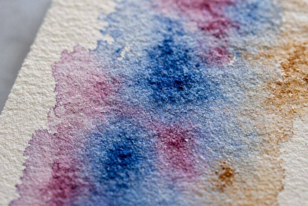
Granulating pigments have particles heavy enough to settle into the texture of the paper as the wash dries, producing a mottled, mineral surface you can’t fake with a brush. Ultramarine (PB29), cerulean (PB35), the umbers, viridian (PG18), and potter’s pink (PR233) all granulate. The phthalos and quinacridones don’t. They lie down perfectly flat.
The technique worth knowing is to pair a granulating pigment with a staining one in the same wash. The staining pigment sinks into the fiber and stays put while the granulating pigment separates and settles on top, so the two colors physically stratify on the paper and you get two distinct visual layers from a single application. Ultramarine with quinacridone rose does this beautifully, as does cerulean with any of the phthalos.
Rough cold-press paper amplifies granulation dramatically and hot-press nearly eliminates it. Hard water reduces the effect and distilled water increases it.
Breaking the Rules on Purpose
Everything above describes how to make color behave. Some of the best work comes from making it misbehave, but there’s a difference between dissonance and accident, and the difference is visible to the viewer.
Deliberate dissonance means placing colors that shouldn’t work together and then supporting that decision everywhere else in the painting: committing to it in scale, repeating it, letting the value structure hold the composition while the color fights. Accidental dissonance means one passage looks wrong and everything else looks careful.
The clash that tends to work is a saturated color placed next to its near-complement rather than its true complement, so orange against blue-violet instead of against blue. The relationship is close enough to feel intentional and off enough to unsettle.
Five Studio Exercises
Work through these in order. Each takes under an hour.
1. The two-pigment grid. Choose any two pigments and paint a 5×5 grid moving from 100% of one to 100% of the other, varying the ratio horizontally and the water content vertically. You now know that pair completely. Repeat for every pair on your palette.
2. The complementary neutral run. Pick a complementary pair and paint a strip of nine swatches running from full-strength A through the neutral midpoint to full-strength B. Label the pigments and tape it to the wall. It becomes your reference for every gray you’ll ever need.
3. The three-pigment painting. Complete an entire abstract using only quinacridone rose, phthalo blue green shade, and nickel azo yellow. No other paint. This one is uncomfortable and teaches more than the other four combined.
4. The grayscale test. Paint anything, photograph it, convert to black and white, and correct the value structure before you consider it finished. Do this for ten consecutive pieces and it becomes automatic.
5. The stratification study. Pair each granulating pigment on your palette with each staining one in a wet wash and let them dry completely without touching them. Note which combinations separate most dramatically.
Common Mistakes
- Mixing on the paper without tracking what’s already there. Two pigments in a wash plus two more dropped in is four pigments, and four is mud.
- Using tube black for shadows. It desaturates everything it touches. Mix your darks from complements instead.
- Reaching for a new tube when the problem is a ratio. It usually is.
- Dirty water. Two jars, one for rinsing and one for mixing.
- Judging color while it’s wet. Watercolor dries twenty to thirty percent lighter, so test on a scrap of the same paper and let it dry before committing.
- Buying student-grade paint and blaming yourself for the results. Student grades contain fillers and less pigment. Six good tubes beat twenty-four mediocre ones.
Frequently Asked Questions
Why do my watercolors turn muddy when I mix them? Almost always one of three causes: more than three pigments in the mix, two pigments whose undertones lean in opposite directions, or an opaque earth pigment mixed with a transparent staining one. Reduce to two pigments per mix and check the pigment codes on your tubes.
What is the best limited palette for abstract watercolor? For maximum mixing range, a split primary palette of six single-pigment paints, one warm and one cool version of each primary. For atmospheric work, four pigments: yellow ochre, burnt sienna, ultramarine, and ivory black. For learning, three transparent staining pigments and nothing else.
How do I mix a clean violet? Use a cool red that leans violet, such as quinacridone rose (PV19), with a warm blue that also leans violet, such as ultramarine (PB29). A warm orange-leaning red combined with a cool green-leaning blue introduces a hidden yellow and produces brown.
What does a pigment code like PB29 mean? It identifies the actual chemical pigment in the tube, independent of the brand name. P stands for pigment, B for blue, and 29 for the specific compound, in this case ultramarine. Two tubes with different names but the same code contain the same colorant.
Should I use black paint? For mixing darks, no. Mix them from complementary pairs, which produces darks that carry color temperature. As a standalone color in a deliberate palette, black is fine, but it desaturates anything it’s mixed into.
Which watercolor pigments granulate? Ultramarine (PB29), cerulean (PB35), viridian (PG18), potter’s pink (PR233), and most of the umbers and iron oxides. Phthalos and quinacridones don’t granulate. Rough cold-press paper amplifies the effect.
How many colors should be on my palette? Six to twelve, all single-pigment. Range comes from knowing your pigments thoroughly rather than from owning more of them.
Do I need to understand color theory to paint abstractly? No, but you need it to repeat your successes. Intuition produces good paintings occasionally. Understanding what happened lets you produce them deliberately.
Where to Go Next
Color theory isn’t a set of rules to obey. It’s a description of what’s already happening on your paper, and once you can name it you can steer it.
Start with the first exercise. Two pigments, one grid, one hour. It’s a duller way to spend a morning than starting a painting, and it will change more about your work than the painting would have.
- “Ultramarine and Burnt Sienna: Every Gray You’ll Ever Need”
- “Granulating Watercolor Pigments: A Complete Reference”
- “How to Build a Limited Palette for Abstract Painting”
- “Reading Pigment Codes: What the Numbers on Your Paint Tube Mean”