The Watercolor Color Wheel: A Working Artist’s Guide to Color Theory and Mixing
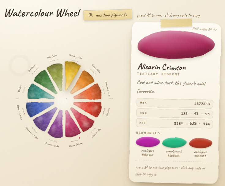
Every watercolor journal I have ever kept starts the same way. Before the landscapes, before the florals, before anything ambitious, there is a page with twelve little washes arranged in a circle. Some of them bloomed where I left too much water. Some dried with those dark, crisp edges that watercolor insists on leaving behind. It looks like a simple beginner exercise. It is actually the most useful page in the whole book, and I still flip back to it more often than anything else I have painted.
That page is a color wheel, and I have put an interactive version of mine right here on the site. Hover over any wedge and it will introduce itself. Click one and you get its full field notes: the hex, RGB, and HSL values if you also work digitally, plus its complement and neighboring harmonies. There is a mixing mode too (press M) that glazes any two pigments together so you can see what they settle into before you commit real paint to real paper. Spin it, poke it, steal colors from it. But first, a quick tour of what a color wheel is actually for, because once you can read one, half of color theory stops being theory.
Watercolour Wheel
press M to mix · click any code to copy
What a color wheel actually tells you
A color wheel is a map of relationships. That is the entire trick. Colors that sit next to each other blend quietly. Colors that sit across from each other create contrast, and when you mix them, they neutralize each other into grays and browns. Colors a third of the way around the wheel from each other form the classic triads that painters have leaned on for centuries.
Beginners often treat the wheel like a poster to memorize. Painters use it like a recipe card. When I am standing in a field with a limited palette and the light is changing fast, I am not thinking about theory. I am thinking, the shadow on that adobe wall needs to lean toward the opposite side of the wheel from the sunlit part, and I know where that is without looking, because I painted the map myself.
If you take one thing from this whole article, take that. The wheel is not decoration. It is the fastest answer to the question every watercolor painter asks a hundred times per painting: what do I mix to get that?
Primary colors in watercolor: the three you cannot mix
Start with the primaries: a warm yellow, a true red, and a dependable blue. On my wheel that is Cadmium Yellow, Cadmium Red, and Ultramarine Blue. These are the three colors you cannot make by mixing anything else. Everything on the wheel descends from them, and honestly, most of what ends up in a finished painting does too.
If you are just starting out and the art store wall of tubes is making your head swim, this is your permission slip to buy three colors and a decent round brush. A limited palette will teach you more in a month than a 48-color set will teach you in a year, because with three pigments you have no choice but to learn what they do together. Every green in your painting will be a green you built. Every gray will have a history. Your paintings will also hang together better, since every mixture shares the same three parents. Color harmony gets a lot easier when the colors are literally related.
One practical note about pigments. Cadmium Yellow and Cadmium Red are the classic names, and many brands now sell excellent cadmium-free versions under similar names. Ultramarine Blue, which started life centuries ago as ground lapis lazuli, is inexpensive, permanent, and granulates beautifully. If your palette holds different pigments, that is fine. The positions on the wheel matter more than the labels on the tubes.
Secondary and tertiary colors: where mixing gets interesting
Mix any two primaries and you get a secondary. Yellow and red make orange. Red and blue make violet. Blue and yellow make green. On the wheel they sit exactly halfway between their parents, which is the quiet genius of the whole diagram. The geometry is the recipe.
Keep subdividing and you reach the tertiary colors, the in-between mixtures like Indian Yellow, Vermilion, Alizarin Crimson, Ultramarine Violet, Viridian, and Olive Green. These are where watercolor earns its reputation for subtlety. A landscape painted only in pure primaries and secondaries reads like a poster. A landscape that leans on the tertiaries reads like an actual afternoon in an actual place.
The tertiaries are also where current taste lives. The palettes showing up everywhere in 2026 are built on rich earth tones: clay red, warm ochre, terracotta, moss green, and soft granulating neutrals. Look at where those colors sit on the wheel and you will notice they are mostly tertiaries that have been muted with a touch of their complement. Trend colors come and go, but they are always mixable, and the wheel shows you how. You do not need to buy a tube called Moss Green. You need Sap Green, a whisper of red, and thirty seconds.
How watercolor mixing really works: pigment mixes darker
Here is the lesson the wheel teaches that no amount of reading quite replaces. Pigment does not behave like light. On a screen, mixing colors pushes them toward white. In the palette well, mixing pushes them toward mud. Every pigment you add subtracts a little more light from the paper, which is why painters call it subtractive mixing and why your first attempts at mixing green probably came out looking like swamp water. Mine did.
Watercolor adds its own personality on top of that. Some pigments granulate, meaning the particles settle into the texture of the paper and dry with a speckled, mineral look. Ultramarine is famous for it, and granulating colors are having a real moment right now, with paint makers releasing new granulating violets, greens, and neutral sets aimed at landscape and plein air painters. Some pigments are transparent and glaze beautifully in layers. Some are opaque and sit on top. Water does the rest: back-runs, blooms, soft edges into wet paper, hard dried rims where a wash stopped.
For years, teachers treated those effects as flaws to control. The current mood in the watercolor world has swung the other way. After a decade of slick digital content, people are craving visibly handmade work, and the blooms, the uneven edges, and the granulation are the proof of the hand. You can see it in the explosion of paint-with-me videos and real-time color mixing content online, where the pleasure is watching pigment and water argue with each other. My advice has not changed in twenty years of keeping journals: stop fighting the medium. The accidents are the medium.
Try this in the mixing mode on the interactive wheel. Two neighbors, say Cadmium Yellow and Indian Yellow, melt together without a seam. Colors a quarter of the wheel apart give you a softened, dusty in-between. Near-opposites argue for a moment and then settle into a moody neutral. That last behavior is the most useful trick in the entire circle, so it gets its own section.
Complementary colors: how to mix shadows without black
Every color on the wheel has an opposite sitting directly across from it. Yellow faces violet. Red faces green. Blue faces orange. Artists call these pairs complementary colors, and they do two opposite jobs depending on whether you place them side by side or mix them together.
Side by side, complements make each other sing. An orange rooftop against a blue sky feels electric. A red barn in a green field practically hums. If a painting feels flat and you cannot say why, check whether anything in it is playing against its complement. Usually nothing is.
Mixed together, complements quiet each other down into grays and browns that are far more alive than anything from a tube labeled Payne’s Gray. This is how I mix nearly all of my shadows, and it is the first thing I teach anyone who asks. Take the color of the thing and pull it toward its complement. The shadow of a green leaf gets a touch of red. The shadow on a yellow pear gets a little violet. The shadow side of an orange canyon wall gets a breath of blue. The painting stays in color even in its darkest passages.
And please, hide the black. A tube black deadens a watercolor faster than any other habit I know. If you want a rich dark, mix Ultramarine Blue with a warm brown or with Alizarin Crimson and let the granulation do the talking. Your darks will shimmer instead of going silent.
Warm colors, cool colors, and why temperature runs the painting
Fold the wheel in half from yellow down through violet and the two halves have completely different temperatures. The reds, oranges, and yellows advance toward the viewer. The blues, greens, and violets recede. You will find little pencil notes reading warm and cool on the interactive wheel, in the same spots where I scribble them on my own journal pages.
Temperature is the quiet engine of a painting. Warm light means cool shadows. Cool light means warm shadows. A late-afternoon scene with golden light wants blue-violet shadows, and an overcast scene with silvery light wants shadows that lean warm and brown. Get that relationship right and a painting glows even when the drawing is wobbly. Get it wrong and no amount of careful detail will rescue it. When one of my paintings dies on the paper, temperature confusion is the cause more often than any other single thing.
Temperature also gives you atmospheric depth for free. Cool and gray the colors as things recede, warm them as things come forward, and suddenly your flat wash of hills has air between the ridges.
Color harmonies worth knowing by name
Once the wheel is in your head, the classic harmony schemes stop being vocabulary words and start being starting points. Analogous harmony uses three or four neighbors, like blue, blue-violet, and violet, and gives you instant unity; most of my quiet evening paintings are analogous schemes with one warm accent smuggled in. Complementary harmony builds a painting around one opposing pair and lets them fight politely. Split-complementary takes a color plus the two neighbors of its complement, which keeps the contrast but softens the collision, and it is my usual suggestion for painters who find straight complements too loud. Triadic harmony spaces three colors evenly around the wheel, and the primary triad of yellow, red, and blue is the reason the three-color limited palette works at all.
Click any wedge on the interactive wheel and the card will hand you its complement and analogous partners, with copyable codes. Which brings me to the digital elephant in the studio.
Paper and pixels: using hex codes with real pigment
Plenty of us now plan paintings digitally and finish them on paper, or scan finished watercolors for prints and cards. Digital watercolor brushes keep getting more convincing, and doing quick color studies on a tablet before committing to a full sheet has become a completely normal part of many workflows, mine included on lazy days. So the interactive wheel speaks both languages. Every pigment carries its hex, RGB, and HSL values, and one click copies them, ready for Procreate, Photoshop, or your website. The harmonies work identically in both worlds. The only difference, as we covered, is that pixels mix toward light and pigment mixes toward earth. Plan on the screen if it helps you see. Paint on paper because nothing else feels like it.
Paint your own color wheel: the exercise
The interactive wheel is a reference. The learning happens with a brush, so here is my standing assignment for every student, and my invitation to you, especially with World Watercolor Month coming every July if you want an excuse to start a daily practice.
Draw two light pencil circles, one inside the other, and divide the ring into twelve wedges. Lay in your three primaries first, spaced evenly at twelve, four, and eight o’clock. Mix your secondaries and place them halfway between their parents. Then mix the tertiaries between those. Use the actual pigments in your actual palette, not the ideal ones from a book, because the entire value of the exercise is discovering what your yellow and your blue really make together. It is never quite the green you expected.
Let each wedge lighten toward the center, as if the wheel were lit from within, and let the pigment pool and darken at the outer rim. Leave thin white gaps of clean paper between the wedges. Do not fuss the edges. The blooms and back-runs and granulation are the point, not the flaw, and a wheel that looks hand-painted will teach you more than one that looks printed. When it dries, label each wedge in your own handwriting: primary, secondary, tertiary, and the pigment names. If a leaf or two finds its way onto the bottom of the page while you test your new mixes, that is tradition, and you will not be the first painter to lose an hour to it.
Tape the finished page inside your palette lid or pin it above your desk. Mine is warped, stained, and seven years old, and I would not trade it for any chart money can buy.
Now go spin the wheel above. Hover, click, mix, and steal any color you like. Then go mix the real thing.